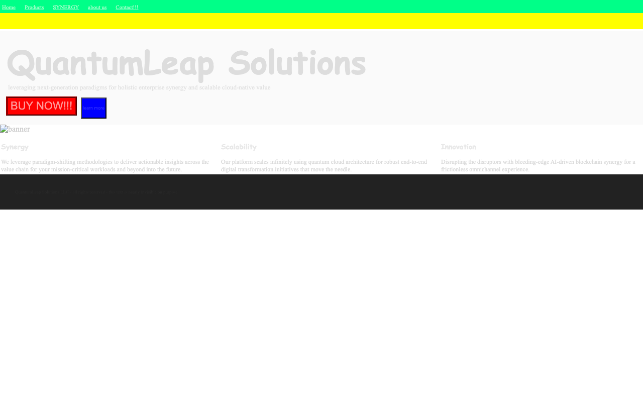
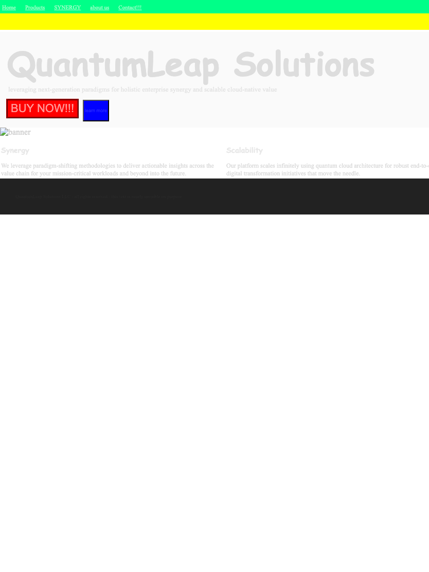
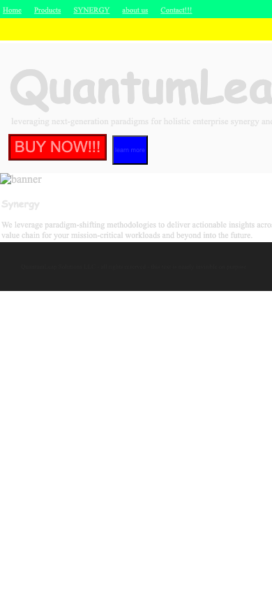
A deliberately broken SaaS page
Dead JavaScript, a 404 hero image, neon clashing palette, near invisible text, no responsive handling.
LOOP BACK
Live run: capture across 3 viewports, functional check, design grade through the harness.
Functional: FAIL
0.3/10
console [desktop] computeQuarterlySynergy is not defined
console [desktop] Failed to load resource: the server responded with a status of 404 (Not Found)
console [tablet] Failed to load resource: the server responded with a status of 404 (Not Found)
network [desktop] 404 http://127.0.0.1:49575/assets/hero-banner-final-v3-USE-THIS-ONE.png
network [tablet] 404 http://127.0.0.1:49575/assets/hero-banner-final-v3-USE-THIS-ONE.png
network [mobile] 404 http://127.0.0.1:49575/assets/hero-banner-final-v3-USE-THIS-ONE.png
graded via nyx-coder · claude-code CLI cannot carry vision, so the harness fell back to the Gemini API route
8 findings — what's wrong, what better looks like
-
highThe design completely fails to be 'polished' or 'trustworthy'. The chaotic colors, poor typography, and lack of layout give it an amateurish, dated, and untrustworthy appearance, actively repelling rather than building confidence.betterA clean, modern layout with a professional color palette, legible typography, and generous whitespace. This would establish credibility and make users feel comfortable.
-
highWhile the primary action 'BUY NOW!!!' is visually loud due to its red color, its aggressive styling (all caps, multiple exclamation points, harsh rectangle) undermines the goal of building confidence and feels more like a low-quality ad than a trustworthy SaaS call to action.betterA single, clearly-defined primary call-to-action button that uses the brand's accent color, has clean typography (e.g., 'Get Started' or 'Buy Now'), and is placed prominently in the hero section.
-
highThe color palette is jarring and unprofessional, using multiple clashing, highly saturated colors (neon green, bright yellow, pure red, pure blue). This violates the 'cohesive, limited palette' rule.betterA restrained palette using neutrals like white and gray, with a single brand accent color for interactive elements to create a calm, professional aesthetic.
-
highThe color contrast for nearly all text (headline, sub-headline, body copy) is extremely low. The light gray text on a white/light-gray background is almost unreadable and is a severe accessibility failure.betterUsing a dark color for text (e.g., #212121 or dark gray) on a light background to meet WCAG AA accessibility standards and ensure legibility.
-
highThe typography is unprofessional. The main headline uses a decorative, rounded font reminiscent of Comic Sans, which is inappropriate for a trustworthy SaaS product. Multiple, inconsistent font styles are used.betterUsing one or two standard, legible web font families (e.g., Inter, Poppins, or a classic serif/sans-serif pairing) consistently for headlines and body text.
-
highThere is no discernible grid, spacing system, or alignment. Elements are centered without relation to each other, and the three feature columns are misaligned, creating a messy and disorganized look.betterApplying a consistent grid (e.g., 8px rhythm) to align all elements and manage spacing, ensuring a structured and harmonious layout.
-
highThe page completely lacks polish. It features harsh rectangular buttons, a broken image icon, jarring colors, and no subtle details like soft shadows or rounded corners, resulting in a dated and untrustworthy feel.betterAdding subtle refinements like rounded corners on buttons, high-quality imagery (instead of a broken link), and intentional use of whitespace to create a modern, high-quality impression.
-
highVisual hierarchy is nonexistent. The low-contrast headline fails to be dominant, while the garish header colors and aggressive CTA all compete for attention, creating visual chaos.betterEstablishing a clear focal point with a large, high-contrast headline. The primary CTA should be visually distinct but harmonious, and secondary elements should be calm and unobtrusive.
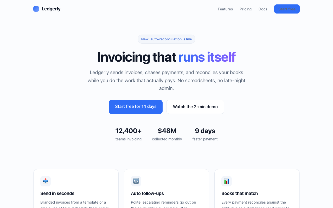
A polished SaaS page
Clear hierarchy, one brand accent, generous spacing, legible type, responsive across viewports.
SIGN-OFF
Live run: capture across 3 viewports, functional check, design grade through the harness.
Functional: PASS
9.7/10
No console errors, no failed network requests
graded via nyx-coder · claude-code CLI cannot carry vision, so the harness fell back to the Gemini API route
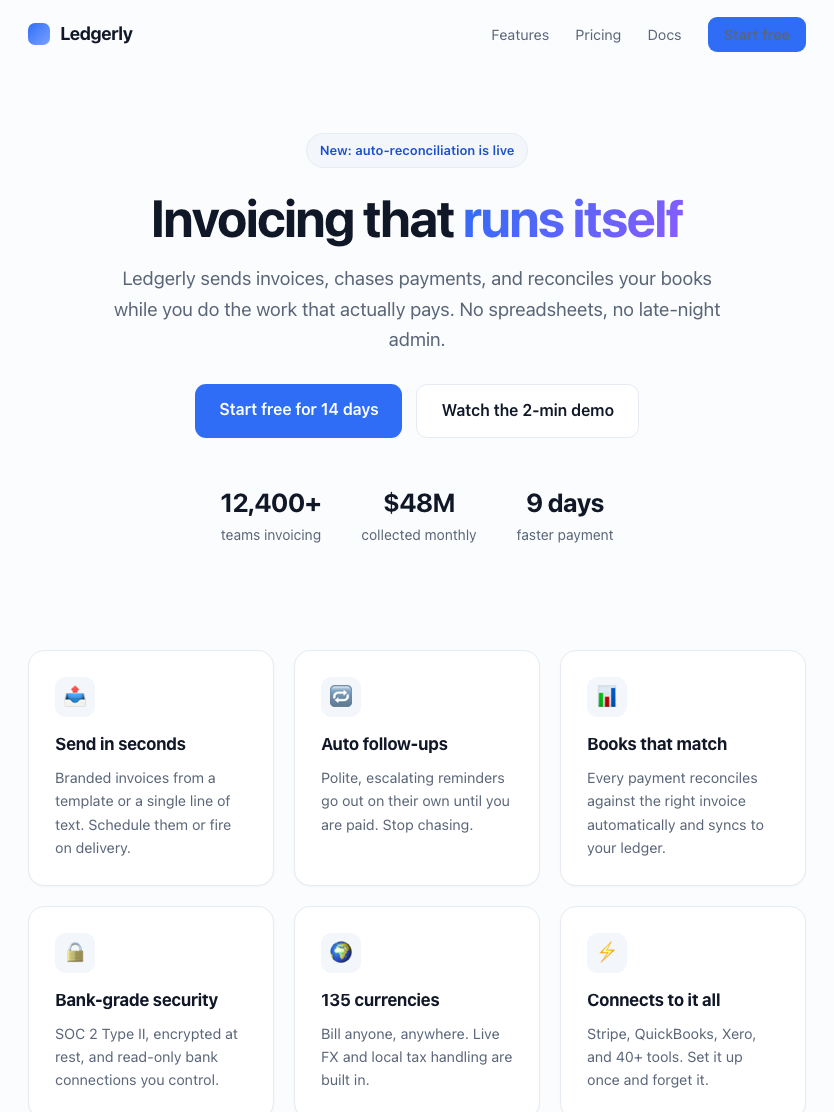
2 findings — what's wrong, what better looks like
-
mediumThe text inside the 'New: auto-reconciliation is live' lozenge has low color contrast against its light blue background, likely failing WCAG AA accessibility standards for its size.betterIncrease the contrast by using a darker blue for the text or a lighter, less saturated background to achieve a ratio of at least 4.5:1.
-
lowThe vertical spacing between the 'New' lozenge and the main headline is slightly too tight, which can make the area feel a little cramped.betterIncrease the space between the lozenge and the headline by 8px or 16px to give both elements more breathing room and improve the visual hierarchy.